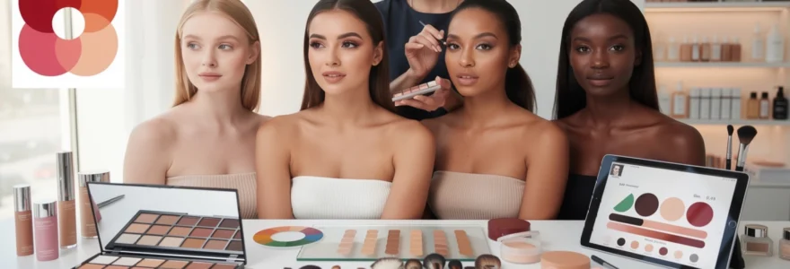
Professional makeup artistry reaches its full potential when practitioners master the complexities of working across the entire spectrum of human complexions. The diversity of skin tones presents both extraordinary opportunities and sophisticated challenges that push artists to develop advanced technical skills, deepen their understanding of colour science, and cultivate cultural sensitivity. Working with clients from varied ethnic backgrounds and with different melanin distributions teaches makeup professionals invaluable lessons about pigmentation science, foundation chemistry, and the artistry required to enhance rather than mask natural beauty.
The journey of mastering makeup application across diverse skin tones transforms artists from technicians into true beauty professionals. Each client with unique undertones, pigmentation patterns, and facial structures presents a masterclass in colour theory, product selection, and application techniques. This comprehensive exploration of inclusive makeup artistry reveals how working with different complexions elevates professional skills and creates more versatile, culturally aware beauty practitioners.
Understanding undertones and pigmentation science in professional makeup application
Professional makeup artistry begins with a deep understanding of how melanin distribution affects skin appearance and how undertones influence product selection. The science behind pigmentation reveals that human skin contains varying concentrations of eumelanin and pheomelanin, which create the vast spectrum of complexions observed across different ethnic groups. These pigments interact with light in complex ways, creating the subtle colour variations that skilled makeup artists must learn to identify and work with effectively.
Warm, cool, and neutral undertone identification techniques using natural lighting
Accurate undertone identification forms the foundation of successful makeup application across all complexions. Professional artists develop systematic approaches to assess undertones using multiple verification methods under optimal lighting conditions. The vein test remains a reliable starting point, where blue or purple veins indicate cool undertones, green veins suggest warm undertones, and blue-green combinations point to neutral undertones. However, this method requires refinement when working with deeper skin tones where vein visibility may be limited.
Natural lighting assessment provides the most accurate foundation for undertone identification. North-facing windows offer consistent, neutral light that reveals true skin colour without the yellow cast of incandescent lighting or the harsh blue tones of fluorescent bulbs. Professional artists position clients at a 45-degree angle to the light source, examining the jawline and neck area where skin tone appears most accurate. The jewellery test complements lighting assessment, as individuals with warm undertones typically appear more radiant in gold accessories, while those with cool undertones are enhanced by silver tones.
Melanin distribution patterns and their impact on foundation matching
Melanin distribution creates unique challenges in foundation matching that extend beyond simple colour selection. Higher melanin concentrations in deeper skin tones can create variations in pigmentation density across different facial areas. The forehead often appears darker due to increased sun exposure, while the area beneath the eyes may show lighter tones. Understanding these natural variations prevents artists from attempting to create uniform colour across the entire face, instead working with the skin’s natural colour map.
Professional foundation matching requires assessment of multiple facial zones to achieve seamless blending. The jawline serves as the primary matching point, as it represents the transition between facial skin and neck colour. However, artists must also consider the chest and décolletage areas, particularly when clients plan to wear clothing that exposes these regions. Oxidation patterns vary significantly across different melanin levels, with some foundations darkening more noticeably on oily skin types common in certain ethnic backgrounds.
Hyperpigmentation and discolouration correction methods for deeper skin tones
Hyperpigmentation presents complex correction challenges that require specialised techniques and products. Post-inflammatory hyperpigmentation (PIH) appears more prominently on deeper skin tones due to increased melanin production in response to inflammation. These dark spots require careful colour correction using orange and peach-based correctors that neutralise the blue and purple tones commonly found in hyperpigmented areas on darker complexions.
Melasma and age spots on deeper skin tones often display brown and grey undertones that respond best to colour correction using complementary orange and yellow-based products. Professional artists layer correction products strategically, building coverage gradually to avoid creating obvious patches or texture issues. The key lies in understanding that deeper skin tones require warmer correction sh
ers rather than the muted, grey correctors often marketed as universal solutions. When correcting hyperpigmentation on darker skin tones, you are not trying to lighten the area, but to bring it back into chromatic balance so that foundation can sit evenly on top. Working in thin, translucent layers and setting each with a minimal amount of powder allows you to maintain skin luminosity while achieving long-wearing coverage that looks seamless in both daylight and flash photography.
Red and orange undertone neutralisation using colour theory principles
Excess redness and strong orange undertones demand a disciplined use of colour theory rather than heavier coverage. Many clients with fair to medium complexions present with diffuse redness around the nose, cheeks, and chin, while some medium to deep skin tones display overly warm, almost orange facial areas compared with the neck. Instead of simply adding more foundation, professional artists reach for targeted correctors that sit opposite these tones on the colour wheel.
Green-based correctors effectively mute red undertones, while carefully chosen blue-based or neutral correctors can soften overly orange areas without turning the skin ashy. The goal is always to neutralise before you perfect: once the unwanted hue is reduced, a thinner layer of foundation is sufficient to create an even, natural-looking base. Artists working across global skin tones learn to read colour like a language, recognising whether the dominant cast is red, orange, or yellow and selecting complementary pigments accordingly. Over time, this ability to decode undertones at a glance becomes one of the most valuable skills in professional makeup artistry.
Technical foundation matching methodologies across the skin tone spectrum
Working with different skin tones quickly reveals that foundation matching is both an art and a technical discipline. Beyond choosing a shade that appears close in the bottle, professional artists develop structured methodologies to account for undertone, depth, texture, and environmental factors like lighting and climate. The process often involves systematic testing, product knowledge across multiple brands, and contingency plans for occasions when an exact shade does not exist.
Artists who consistently deliver flawless foundation matching treat each client like a controlled experiment. They observe how products behave over time, test for oxidation, and assess the interaction between skincare, primer, and foundation on specific skin types. By combining brand knowledge with rigorous testing protocols, professionals create reliable workflows that work across fair, medium, olive, and deep complexions in bridal, editorial, and on-camera environments.
MAC studio fix and fenty beauty pro filt’r shade range analysis
Two of the most referenced professional foundations for inclusive shade ranges are MAC Studio Fix and Fenty Beauty Pro Filt'r. MAC’s long-established NC (neutral cool) and NW (neutral warm) system provides a wide range of undertones, though the nomenclature can be counterintuitive for newer artists, as NC leans more golden and NW more pink. Fenty disrupted the market by launching with 40+ shades focused on nuanced undertones, particularly for medium and deeper skin tones, and has since expanded further, making it a staple in professional kits worldwide.
Experienced artists learn to map these ranges mentally, knowing, for example, that MAC NC42 sits close to Fenty 310–330 on many golden-medium clients, while deeper red-leaning tones may translate from MAC NW45 to Fenty shades in the 420–450 range. This cross-brand literacy becomes vital when you must replicate a client’s usual shade using your own kit, or when you are recommending products for them to purchase later. Analysing how each range handles olive, golden, and cool deep undertones teaches artists that inclusive makeup is not just about the number of shades, but how accurately those shades reflect real skin.
Custom foundation mixing techniques using RCMA and kryolan professional palettes
Even with extensive ranges, there will be times when no single bottle perfectly matches a client’s complexion. This is where professional cream foundation palettes from brands like RCMA and Kryolan become indispensable. These palettes function like a painter’s colour box, allowing you to mix customised shades by adjusting depth, warmth, and saturation with precision. When you work with a wide variety of ethnicities, custom mixing shifts from an occasional trick to a core daily practice.
Effective custom mixing starts with selecting a base colour close to the client’s depth, then fine-tuning undertone using adjacent wells rather than jumping across the palette. A stainless steel mixing palette and spatula maintain hygiene while enabling micro-adjustments—adding a fraction of a peach tone to correct dullness, or a drop of olive to prevent medium skin from skewing orange. By treating foundation like pigment rather than a fixed product, artists can match complex melanin patterns, such as a client with a cool chest, warm forehead, and neutral neck, creating a harmonious blend that respects their natural colour story.
Digital shade matching technology and pantone SkinTone guide applications
As the industry has become more data-driven, digital shade matching tools and systems like the Pantone SkinTone Guide have started to influence professional workflows. Handheld devices and app-based scanners analyse skin and suggest foundation matches across multiple brands, while Pantone’s coded system provides a consistent reference point for skin colour, useful in film, television, and commercial work. For artists who regularly collaborate with photographers, costume designers, or cosmetic chemists, having a shared numeric language for skin tone streamlines communication.
However, working across different skin tones quickly teaches that technology is a supplement, not a replacement, for trained observation. Digital tools can be thrown off by surface redness, flashback, or uneven lighting, particularly on textured or highly reflective skin. The most effective professionals use these systems as a starting point, then rely on their knowledge of undertones, melanin distribution, and how formulas wear over time to make final decisions. In other words, the device may suggest a shade, but your eye decides if it truly disappears into the skin.
Oxidation testing protocols for long-wearing foundation formulations
Oxidation is one of the most frustrating challenges in foundation matching, especially for bridal and long-wear occasions. Many high-coverage formulas deepen or shift warmer after exposure to air and sebum, an effect that can be particularly pronounced on oily or combination skin types common in certain ethnic groups. If you have ever matched a client perfectly at call time only to see their face appear one or two shades darker by midday, you have seen oxidation in action.
To prevent this, seasoned artists develop simple but effective oxidation testing protocols. They apply a thin stripe of candidate shades on the jawline and another set on the inner forearm, noting the initial colour and reassessing after 10, 30, and 60 minutes under natural light. Any formula that darkens significantly or turns orange is either pre-adjusted with a slightly lighter, cooler mix or reserved for shorter-wear scenarios. By building this testing step into your kit preparation, you protect yourself from unpleasant surprises on set and ensure foundation matching remains accurate throughout the entire wear time.
Advanced contouring and highlighting strategies for varied facial structures
Working with diverse faces teaches makeup artists that there is no single contour map that fits every client. Bone structure, soft tissue distribution, and cultural beauty preferences all influence how we place shadows and highlights. A technique that flatters a narrow European nose, for example, may look artificial on a broader African or Southeast Asian nose, and vice versa. Mastery of contouring across different skin tones therefore requires both anatomical knowledge and sensitivity to the client’s aesthetic goals.
On fair and light skin, contour products must be handled delicately; cool taupe and soft neutral browns create believable depth without looking muddy or streaky. On medium, olive, and deep complexions, richer cocoa, espresso, and red-brown tones replicate natural shadow more accurately, while highlighting often leans into warm golds, bronzes, and rose-golds to enhance melanin’s natural luminosity. Rather than dramatically altering features, experienced artists aim to refine and celebrate what is already there, tailoring the intensity and placement of contour to the face in front of them.
Different facial structures also demand different techniques. Round faces often benefit from subtle vertical contouring along the sides of the face to create the illusion of length, while long faces may require more attention along the hairline and chin to balance proportions. High-resolution photography and 4K video have made harsh, unblended contour unforgiving, especially on textured or mature skin, so cream products and soft brushes are frequently preferred for a skin-like finish. Ultimately, working across global features trains you to approach contouring not as a template, but as a custom architectural plan for each individual face.
Eyeshadow pigmentation and blendability challenges on textured skin
Textured eyelids—whether due to dryness, fine lines, scarring, or chronic conditions like eczema—pose unique challenges for eyeshadow pigmentation and blendability. On deeper skin tones, these challenges are amplified when shadows lack sufficient pigment; colours that look vibrant in the pan can appear dusty or patchy on the lid. When you regularly work across the full skin tone spectrum, you quickly learn that formula quality matters at least as much as colour selection.
Highly pigmented, finely milled shadows tend to perform best on textured skin, especially when paired with a primer that smooths without becoming too slippery. Matte formulas should feel creamy rather than chalky to prevent catching on uneven areas, while shimmers and metallics need a balanced particle size so they enhance, rather than emphasise, texture. Have you ever noticed how a chunky glitter accentuates every crease on a mature lid? That is why professional artists often reserve ultra-reflective textures for the mobile lid only, diffusing them toward the crease with transition shades that match or complement the client’s undertone.
Working with different eye shapes—monolids, hooded eyes, deep-set eyes, and prominent lids—further refines an artist’s approach. On monolids and hooded eyes, for instance, creating the illusion of depth with carefully placed gradients becomes more important than following a classic crease-based tutorial. On very deep skin tones, bright bases or white/cream pencils are sometimes used under bold colours to ensure they show true to pan. Over time, these technical adjustments become second nature, allowing you to deliver saturated, blended eye looks that photograph beautifully on every complexion and texture.
Professional colour correction techniques for blemish coverage and skin evenness
Colour correction is where theory meets practicality in everyday makeup artistry. Blemishes, dark circles, redness, and sallowness rarely appear the same on two clients, and melanin levels significantly influence which corrector shades will work. Instead of defaulting to heavier concealer, professional artists use targeted correctors to reduce unwanted colour, then apply less foundation overall. This approach preserves skin realism, prevents cakiness, and is especially important on high-definition cameras that magnify product build-up.
The discipline of working with different skin tones sharpens your instinct for which corrector to reach for and how intensely to apply it. A blue-toned under-eye on fair skin will require a very different approach from a deep, almost charcoal-toned circle on a rich complexion. By thinking in terms of opposing hues on the colour wheel and adapting saturation to the client’s depth of skin tone, you can neutralise discolouration efficiently and invisibly.
Orange and peach corrector application for dark circle neutralisation
Dark circles are among the most common concerns clients bring to professional makeup artists. On light to medium skin tones, these shadows often appear blue or violet, responding well to soft peach or salmon correctors that gently lift and brighten. On tan, olive, and deeper complexions, the under-eye darkness frequently skews more navy or charcoal, calling for richer orange or red-orange correctors to create balance before concealer is applied.
A key lesson from working across the undertone spectrum is that depth and saturation must be adjusted carefully. Too pale a peach on deep skin will turn ashy, while an intense orange on fair skin will be visible even under concealer. The most effective approach is to apply a sheer layer of corrector only where the darkness is strongest—typically the inner corner and trough—then blend the edges with a damp sponge before adding a skin-tone-matched concealer on top. This allows the corrected area to blend seamlessly into the surrounding complexion while maintaining a natural finish.
Green colour correction for rosacea and redness management
Green correctors are the classic remedy for stubborn redness, whether from rosacea, acne, or post-treatment irritation. On fair and light skin, diffuse redness across the cheeks and nose can make foundation application challenging, as heavy coverage may be required without prior neutralisation. A sheer, well-formulated green primer or spot corrector applied before foundation can dramatically reduce the amount of base product needed, keeping the skin looking fresher and less mask-like.
On medium and deeper skin tones, visible redness is often more localised around active blemishes or scars rather than spread across broad areas. In these cases, highly targeted green correction with a small brush is usually sufficient, followed by a neutral or warm-toned concealer that matches the surrounding skin. Because excess green can create a grey cast on melanin-rich complexions, the product should be applied sparingly, almost like a stain. This is where your understanding of balance and restraint—skills honed by working with many different complexions—prevents corrective work from becoming visible in finished makeup.
Purple and lavender correctors for sallowness in fair to medium complexions
Sallow, yellow-leaning skin can often look tired or dull, especially under artificial lighting. Purple and lavender correctors address this by sitting opposite yellow on the colour wheel, subtly brightening the complexion without turning it pink. On fair to light-medium clients, a lavender-tinted primer or liquid corrector can be applied to the central face before foundation to neutralise an overly warm cast and create a more balanced canvas.
In editorial and bridal work, this technique is particularly useful when you need the skin to look fresh in both daylight and flash photography. The analogy of adding a drop of blue to a bucket of yellow paint is helpful: the goal is not to make the skin look purple, but to shift it slightly closer to neutral. On olive or golden-medium tones, the same principle applies, but placement should be more selective—focusing on areas that appear especially dull, such as around the mouth or under the cheekbones, rather than across the entire face.
Setting powder selection and application methods for oil control
Setting powder is often the unsung hero of long-wearing, even-looking makeup, particularly on oily or combination skin. Yet working with darker skin tones reveals how easily the wrong powder can cause flashback or ashiness, even when the foundation underneath is perfectly matched. Translucent powders heavy in silica or with a strong white base may look invisible on fair clients but show up under flash on deep complexions, creating the well-known “white cast” effect in photos.
Professional artists therefore curate a range of powders with different base tones and textures: ultra-fine tinted powders for medium to deep skin, truly clear but low-silica formulas for flash-heavy environments, and slightly brightening powders for under-eye areas on fair to medium clients. Rather than dusting powder indiscriminately over the entire face, they press it strategically into high-movement and high-shine zones—the T-zone, around the nose, and under the eyes—using a puff or dense brush. By controlling where and how much powder is applied, you maintain skin dimension and luminosity while still achieving effective oil control and longevity.
Cultural sensitivity and inclusive beauty practices in professional makeup services
The more you work with different skin tones and facial features, the clearer it becomes that technical skill is only one part of excellent makeup artistry. Cultural sensitivity and inclusive practices are equally essential. Clients from diverse backgrounds bring not only unique complexions but also distinct beauty ideals, religious considerations, and hair and skin histories. A contour style that reads “snatched” in one cultural context may feel harsh or undesirable in another; certain clients may require products that align with halal, vegan, or fragrance-free standards.
Inclusive beauty practice starts before you even pick up a brush. It is reflected in how you present your portfolio, whether your kit visibly accommodates deep as well as fair skin, and how you ask questions during consultation. Do you invite clients to share reference photos that reflect their community’s beauty icons? Do you ask how they typically style their brows or lips, and what feels like “too much” for them? These conversations build trust and ensure that your technical decisions align with each client’s identity and comfort level.
From a business perspective, artists who invest in inclusivity often see tangible benefits. Industry surveys in the UK and US over the past few years have shown rising demand for makeup professionals who can confidently work on all complexions, particularly for weddings, TV, and commercial campaigns that aim to reflect real-world diversity. By deliberately practising on a wide range of faces, studying global beauty aesthetics, and maintaining a kit that genuinely supports every skin tone, you position yourself not only as a skilled technician but as a respectful collaborator in each client’s self-expression. In the end, working with different skin tones does not just improve your colour matching—it expands your understanding of beauty itself.