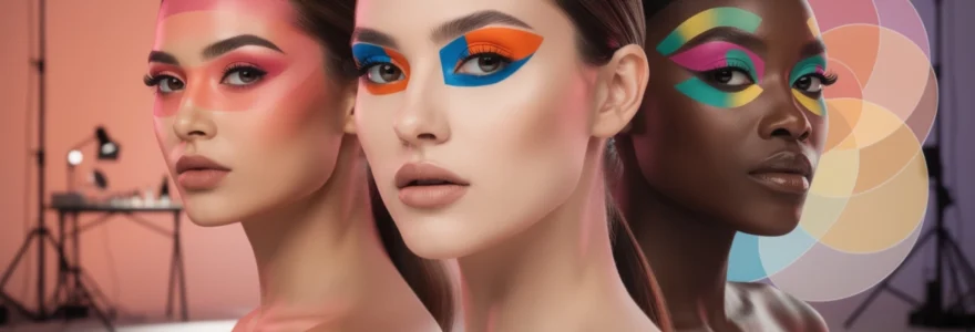
The world of makeup artistry has always drawn inspiration from diverse creative movements, and few have been as transformative as the colour-blocking phenomenon that emerged from the abstract art revolution of the early 20th century. This bold aesthetic approach, which originally found its voice through Piet Mondrian’s Neo-Plasticism movement, has evolved into one of the most striking and versatile trends in contemporary beauty. Unlike subtle contouring or natural enhancement techniques, colour blocking demands attention through its unapologetic use of vibrant, contrasting hues applied in distinct geometric sections across the face. The technique represents a departure from traditional blending methods, instead celebrating sharp lines, saturated pigments, and the dramatic interplay between complementary colours that can transform any makeup look from ordinary to extraordinary.
Understanding colour blocking theory in professional makeup artistry
The foundation of successful colour blocking lies in understanding the scientific principles behind colour theory and how they translate to facial application. Professional makeup artists rely on established colour relationships to create harmonious yet impactful looks that enhance rather than overwhelm the wearer’s natural features. The psychological impact of colour combinations plays a crucial role in determining the overall success of a blocked look, as certain pairings can evoke specific emotions or create optical illusions that alter facial proportions.
Complementary colour wheel applications for High-Impact looks
Complementary colours, positioned directly opposite each other on the colour wheel, create the most striking visual contrast when used in colour blocking applications. The pairing of blue and orange, red and green, or yellow and purple generates maximum visual impact while maintaining aesthetic balance. These combinations work particularly well for editorial or avant-garde looks where the goal is to create dramatic visual tension. When applying complementary colours, the key lies in controlling the saturation levels to prevent overwhelming the eye while still achieving the desired bold effect.
Analogous colour schemes in editorial makeup design
Analogous colour schemes utilise hues that sit adjacent to each other on the colour wheel, creating more harmonious and wearable colour blocking effects. This approach works exceptionally well for clients seeking a bold yet sophisticated look that remains appropriate for various occasions. The seamless flow between similar tones, such as moving from coral through orange to yellow, or from blue through purple to magenta, creates visual interest without the jarring contrast of complementary schemes.
Triadic colour combinations for Avant-Garde beauty concepts
Triadic colour schemes involve three colours equally spaced around the colour wheel, offering vibrant contrast while maintaining colour harmony. This advanced technique requires considerable skill to execute effectively, as the challenge lies in balancing three distinct hues without creating visual chaos. Professional artists often use triadic combinations for high-fashion editorial work or theatrical applications where bold artistic expression takes precedence over conventional beauty standards.
Monochromatic blocking techniques with tonal variations
Monochromatic colour blocking focuses on variations within a single colour family, utilising different saturations, tints, and shades to create depth and dimension. This sophisticated approach allows for dramatic impact while maintaining an cohesive aesthetic that flatters most skin tones. The technique involves strategically placing lighter and darker versions of the same base colour to sculpt and define facial features while creating visual interest through tonal contrast rather than colour opposition.
Professional colour blocking techniques and application methods
Mastering colour blocking requires precision, patience, and an understanding of various application techniques that can dramatically alter the final result. The choice between gradient blending and sharp demarcation lines fundamentally changes the character of the look, while proper brush selection and product layering determine both the vibrancy and longevity of the finished application. Professional artists develop their own signature approaches through experimentation with different tools and methods, understanding that technique adaptation is essential for achieving consistent results across diverse clients and occasions.
Gradient blending vs sharp demarcation line execution
The decision between gradient blending and sharp demarcation lines defines the overall aesthetic direction of a colour-blocked look. Sharp lines create architectural precision reminiscent of Mondrian’s original artwork, requiring steady hands and the right tools to achieve clean separation between colours. Conversely, gradient blending softens the transition between blocked colours, creating a more wearable interpretation
between hues while still reading as deliberate blocks of colour. Both approaches can be effective for makeup colour blocking; the choice depends on the context, the wearer’s personality, and the intended impact of the look.
For sharp demarcation lines, professionals often use flat, angled brushes combined with cream or liquid formulas before setting with powder. Mapping out the shape with a nude pencil or a light sketch of eyeshadow helps ensure symmetry. When creating a gradient blend within a blocked area, artists build intensity at the centre or outer edge, then diffuse the pigment outward using a clean blending brush or fingertip, much like airbrushing a mural. If you are new to colour blocking, experiment with both crisp lines and blurred edges on one eye each to see which visual language feels more authentic to your style.
Geometric shape creation using precision brushwork
One of the hallmarks of modern makeup colour blocking is the use of strong, graphic geometry across the eyes and face. Shapes like rectangles across the lid, floating lines along the brow bone, or angular wings extending towards the temples can completely redefine your features. Creating these shapes requires more than simply placing colour; it involves mapping, symmetry, and disciplined brush control that echo the principles of graphic design applied to the face.
Professional artists start by identifying natural facial landmarks: the crease, brow arch, outer corner of the eye, and highest point of the cheekbone. These points act as anchor coordinates for geometric shapes, ensuring the design enhances bone structure rather than fighting against it. Precision brushes with firm, synthetic bristles—liner brushes, flat shaders, and detail brushes—are essential tools for drawing clean edges and filling in blocks evenly. Think of these tools as your rulers and fine liners in a sketchbook, allowing you to “draw” architecture rather than simply sweep on colour.
To make geometric colour blocking more wearable, you can scale down runway shapes into smaller accents. For example, a thin bar of cobalt blue following the crease, or a vertical block of lime at the inner corner, can add editorial impact without overwhelming the face. Using tape or reusable silicon stencils is another pro secret that helps beginners achieve razor-sharp angles and symmetry in a fraction of the time. Once the stencil is removed, a quick touch-up with concealer along the edges ensures the geometry looks intentional and polished.
Layering pigmented formulas for vibrant colour saturation
High-impact makeup colour blocking depends on saturation: the richer and more even the pigment, the more professional the final result appears. Achieving this kind of colour payoff is rarely about a single product swipe; it’s about strategic layering. Much like a painter priming a canvas before building colour, makeup artists work in stages, starting with a base that grips pigment and prevents patchiness. A tinted or white eye base, cream shadow, or even a colour-correcting paint stick can dramatically amplify the intensity of brights placed on top.
Once the base is in place, artists press—not swipe—powder pigments onto the skin using a dense brush or fingertip. Pressing motions pack particles tightly, eliminating gaps and streaks that can sabotage a clean block effect. For especially bold or neon looks, professionals often sandwich textures: a cream or liquid colour, set with powder shadow, then intensified with a pressed pigment or loose pigment as the final layer. This “cream–powder–pigment” stack functions like a triple coat of paint, delivering long-lasting vibrancy that photographs beautifully and resists fading under strong lights.
It is equally important to understand when to stop layering. Overloading the skin with too many products can cause cracking or creasing, particularly on mobile areas like the eyelids. To avoid this, focus most of your layering in the centre of each colour block, then gently taper the product towards the edges. This keeps the structure sharp while maintaining flexibility where the skin moves. If you notice your makeup colour blocking starting to look heavy, refine the surface with a slightly damp sponge, bouncing it over the area to meld the layers without dulling the pigment.
Setting techniques for long-wearing blocked colour performance
Because makeup colour blocking often uses dense, opaque coverage and bold shades, longevity becomes a critical concern. Any smudging, transferring, or fading will be immediately noticeable, especially with crisp, architectural lines. Proper setting techniques begin before colour even touches the skin: prepping with oil-controlling primer on oily lids or hydrating eye cream on dry lids helps create a balanced surface. This prevents colour from breaking apart unevenly over the course of the day or under stage lighting.
After colour application, professional artists rarely rely on a single setting method. For powder-based blocks, a finely milled translucent setting powder applied with a small, fluffy brush locks pigment in place while preserving edge definition. For cream or liquid formulas, a colour-matched powder shadow layered lightly on top provides a “grip” that dramatically reduces creasing. In editorial settings where makeup must last through hot lights and multiple outfit changes, artists may use a targeted setting spray misted onto a brush or sponge, then pressed directly over the blocked areas for additional durability.
Setting does not end at powder and spray. Strategic avoidance of high-emollient products near blocked regions is just as important. Heavy balms or oil-based skincare applied too close to graphic colour can cause migration and colour bleeding over time. If you are wearing bold, blocked eyeshadow, consider switching to a long-wear, semi-matte foundation around the eye area and avoid rich eye creams directly under or above the blocks. This kind of thoughtful planning ensures your makeup colour blocking remains as sharp and saturated at the end of the day as it was when first applied.
Product selection for optimal colour blocking results
The success of any makeup colour blocking look rests heavily on product selection. Not all formulas are created equal when it comes to opacity, blendability, and longevity, and certain textures respond better to the sharp lines and dense colour fields that define this trend. Highly pigmented cream shadows, pressed pigments, and matte liquid formulas tend to outperform sheer or shimmer-heavy products, which can look patchy when asked to cover large, uniform areas. When choosing products, think like a muralist: you need paints that are vivid, opaque, and capable of layering without cracking.
Texture is only one part of the equation; finish matters just as much. Matte or soft-satin finishes generally provide the most graphic impact and are more forgiving on textured skin. They create a “flat plane” of colour that mimics fabric or paint, perfect for modern colour blocking. Metallic or glitter formulas, by contrast, can be used strategically to highlight or separate blocks—such as a thin strip of silver between two primary colours—but they rarely perform well as the main block itself. If you do want shimmer, choose tightly packed, high-shine metallics rather than chunky glitters, as these will apply more evenly and are easier to control.
Colour payoff and safety are also key considerations. Professional-grade pigments designed for the eye area are formulated to be safe even in intense hues like neon yellow or cobalt blue, whereas some craft-style pigments may not be eye-safe. Always check product labels, especially when placing bold colours near the waterline or lower lash line. For lips and cheeks, long-wear matte formulas and multi-use creams offer versatility; they can be used to create monochromatic blocking that travels across lids, cheeks, and mouth for a powerful, cohesive statement. Building a small, curated kit of 6–10 high-performance brights in cream and powder textures will give you endless scope for experimenting with different blocking patterns.
Celebrity and runway colour blocking inspirations
Runway shows and red-carpet appearances have been instrumental in pushing makeup colour blocking from avant-garde editorial into mainstream consciousness. Designers like Salvatore Ferragamo, Max Mara, and Gucci have showcased vivid stripes of red, orange, yellow, and aquamarine swept across lids and brow bones, often referencing archival fashion moments such as the famous Ferragamo rainbow shoe. These looks demonstrate how blocked colour can be both graphic and elegant, especially when paired with clean skin and minimal mascara. They also highlight a key principle of the trend: when eyes are this bold, the rest of the face typically stays restrained.
Celebrities have helped to translate these high-fashion concepts into wearable statements for events and music videos. Think of a singer stepping onto the Met Gala red carpet with a single block of hot pink shadow wrapped from the inner corner to the temple, or an actress at a film premiere wearing an unexpected swipe of chartreuse across the lower lash line only. These moments prove that makeup colour blocking can function like jewellery for the face, replacing the need for heavy accessories. You might not be walking a runway, but adopting a simplified version—like a cobalt wing or a tangerine lower-lash block—instantly communicates confidence and creative flair.
What can we learn from these high-impact references? Firstly, that balance is everything. On the runway, artists often pair saturated blocks with bare lashes or “naked fringe” to keep the focus squarely on shape and colour. Lips tend to be neutral or softly blurred rather than competing with the eyes. Secondly, clothing and makeup work together as a single composition. A blocked teal eye might echo a seam line on a dress, or a sunset gradient on the lid might pick up tones in a printed suit. When you plan your own colour blocking, consider your outfit and accessories as part of the same palette; this creates a cohesive, editorial finish even in everyday settings.
Adapting colour blocking for different eye shapes and skin tones
One of the most empowering aspects of makeup colour blocking is its adaptability. With thoughtful placement, blocked colour can flatter every eye shape and skin tone, acting almost like visual contouring. For monolid and hooded eyes, for instance, placing a bold block slightly above the natural crease—on the space between crease and brow bone—ensures that colour is still visible when the eyes are open. Rounded, almond-shaped blocks that follow the natural eye curve can create an illusion of greater lid space, while straight, horizontal bars can make the eye area appear more sculpted and editorial.
For deep-set or downturned eyes, focusing colour on the outer third and angling blocks slightly upward can lift and open the gaze. Rather than chasing a conventional cut-crease, you can experiment with vertical or diagonal blocks that intersect the brow bone and temple, redirecting attention from the orbital hollow to the outer structure. Conversely, for prominent or protruding eyes, placing a saturated block closer to the lash line in a more compact shape can visually “tuck in” the lid and create a sophisticated frame. The key question to ask yourself is: What feature do I want to emphasise or rebalance? Once you know that, you can treat colour as a sculpting tool, not just decoration.
Skin tone plays a major role in how bright colours read on the face. On fair and light complexions, primary brights like cobalt, true red, and lemon yellow tend to appear very bold with minimal product. To keep the look modern rather than costume-like, many artists soften the edges slightly or ground the colour with a touch of taupe or soft brown at the lash line. On medium and olive skins, jewel tones—emerald, sapphire, magenta—sit harmoniously on the skin, delivering high contrast without harshness. Deeper skin tones can carry neon and ultra-saturated shades beautifully; electric orange, fuchsia, and vivid turquoise often look especially striking. If a colour appears dull or ashy, warming it up with a peach or brick-toned base usually restores vibrancy.
Monochromatic colour blocking offers an accessible way to adapt the trend to any complexion. Using a single colour family—say, brick red on deep skin, rosewood on medium skin, or soft raspberry on light skin—across eyes, cheeks, and lips creates an intentional, editorial effect without the complexity of multiple hues. It’s like dressing in one colour head to toe; the impact comes from shape and texture rather than loud contrast. As you experiment, remember that there are no absolute rules: your undertone, personal style, and comfort level should guide how far you take the contrast or how soft you keep the transitions.
Troubleshooting common colour blocking challenges and solutions
Even with careful planning, bold makeup colour blocking comes with its own set of challenges. Patchy application is one of the most frequent complaints, especially with mattes and neons. This usually stems from applying intense powders over an oily or unprimed lid, or from over-blending. To fix this, start with a thin, slightly tacky base—either an eye primer or a neutral cream shadow—then build colour using pressing motions. If patchiness appears after the first layer, resist the urge to scrub at it; instead, let the product set for a moment, then gently tap a second layer directly over the sparse areas.
Another common issue is colour transfer and creasing, particularly on hooded lids or in hot, humid conditions. Here, preparation and setting are your allies. Keep emollient skincare away from areas where you plan to block colour, and opt for waterproof or long-wear formulas on more mobile parts of the lid. After application, lightly set the edges of your blocks with translucent powder or a coordinating shadow to create a soft “barrier” that reduces movement. If you know you’ll be wearing the look for many hours, carrying a small angled brush and cotton bud in your bag allows you to quickly sharpen lines or clean up smudges throughout the day.
Symmetry can also prove challenging, especially when working with complex shapes or multiple shades. Treat your face as a canvas with a grid: use the centre of the nose, pupils, and brows as reference points to map out where blocks should start and end. Lightly sketch guidelines with a nude or white pencil before committing to full pigment. If one side ends up slightly higher or thicker, you can often correct it not by removing product, but by subtly expanding the shape on the opposite side to match. Think of it like tailoring a garment; small adjustments can make the overall design feel balanced and intentional.
Finally, some people worry that intense colour will clash with their outfit or feel too theatrical for everyday wear. The solution here is to scale the trend to your comfort level. Instead of a full rainbow lid, try a single blocked shade along the lower lash line, or a narrow strip of colour at the inner corner. You might find that once you grow accustomed to seeing bold colour on your face, what once felt daring quickly becomes your new neutral. Makeup colour blocking is less about perfection and more about expression; when you approach it with curiosity rather than pressure, “mistakes” often turn into the most interesting and personal parts of the look.