Neon fashion has evolved from its bold, rebellious 1980s origins into a sophisticated styling tool that adds vibrancy and personality to contemporary wardrobes. The challenge many face isn’t whether to incorporate these electric hues, but rather how to deploy them strategically without crossing the line from fashion-forward to visually overwhelming. Understanding the science of colour integration, fabric selection, and contextual appropriateness transforms neon from a potentially garish choice into an elevated accent that commands attention whilst maintaining refined elegance. The resurgence of fluorescent tones across recent runway collections from Balenciaga, Off-White, and Y/Project demonstrates that these high-visibility shades have secured their position beyond fleeting trend status, offering endless possibilities for those willing to master the technical nuances of neon styling.
Colour theory fundamentals for neon integration in contemporary fashion
Mastering neon accents begins with understanding the underlying principles of colour theory as applied to high-saturation pigments. Unlike traditional colour palettes, neon hues operate at maximum chromatic intensity, which fundamentally alters how they interact with surrounding tones and textures. The scientific approach to integrating these fluorescent shades requires knowledge of established colour systems and strategic application methods that prevent visual cacophony whilst maintaining the energetic appeal that makes neon so compelling in modern fashion contexts.
Understanding the munsell colour system and neon saturation levels
The Munsell Colour System provides a framework for understanding neon’s unique position within the chromatic spectrum. Neon pigments achieve their distinctive appearance through maximum saturation levels combined with high luminosity values, typically exceeding 90 on the Munsell value scale. This technical characteristic explains why neon yellow appears to emanate light rather than simply reflect it. When incorporating these shades into your wardrobe, recognising that neon operates at the extreme end of saturation allows you to calibrate surrounding elements accordingly. Standard colour theory suggests pairing high-saturation colours with low-saturation complements, but neon’s intensity demands even greater restraint in accompanying hues.
Complementary versus analogous colour pairing with fluorescent hues
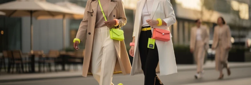
Complementary colour schemes place neon shades opposite their counterparts on the colour wheel—think electric orange against navy blue or hot pink against forest green. This approach creates maximum visual contrast, suitable for statement-making ensembles where you deliberately want to draw focus. However, analogous pairing offers a more nuanced method for neon integration. Placing highlighter yellow alongside softer citron or lime creates a graduated intensity that feels intentional rather than jarring. Recent collections from contemporary designers demonstrate this technique effectively: a neon coral bag paired with terracotta trousers and a rust-coloured blouse creates chromatic harmony whilst maintaining the energetic punch of fluorescent accents. The key lies in understanding that neon shouldn’t exist in isolation—it performs best when supported by tonal relatives that bridge the intensity gap between fluorescent brilliance and neutral foundations.
The 60-30-10 rule applied to High-Visibility accent pieces
Interior designers have long employed the 60-30-10 proportion rule to achieve balanced colour distribution, and this principle translates remarkably well to fashion applications involving neon. Allocate 60% of your outfit to a dominant neutral shade—black, white, beige, or grey—that provides visual rest. The secondary colour occupies 30% of the composition, ideally a mid-tone that mediates between your neutral base and the neon accent. Reserve the final 10% for your fluorescent highlight, whether that manifests as neon accessories, a vibrant shoe, or a single garment detail. This mathematical approach might seem rigid, but it provides a failsafe structure when you’re uncertain about proportional balance. A practical application might involve black trousers and a white shirt (60%), a camel blazer (30%), and neon yellow hoop earrings with matching nail polish (10%)—a combination that feels cohesive rather than chaotic.
Neutralising neon intensity through tonal balance techniques
Even when following established colour principles, neon
can feel less aggressive when framed with softer surrounding tones. Think of neon as a spotlight on a dark stage: the brighter the beam, the more you need shadow and negative space around it. In practical terms, this means pairing highlighter hues with desaturated neighbours—stone, oatmeal, washed denim, charcoal, and soft pastels. You can also neutralise neon intensity by echoing a whisper of the colour elsewhere in the look, such as a faint chartreuse stripe on a shirt that nods to neon sneakers. Texture plays a role too: coarse knits, brushed cotton and linen naturally diffuse colour, making neon trims, drawcords and piping appear subtler than if they were rendered in slick synthetics.
Strategic placement methods for fluorescent accessories and garments
Once you understand how neon behaves within a colour palette, the next step is deciding where to place those fluorescent accents on the body. Strategic placement allows you to enjoy neon fashion without overwhelming your look or feeling like you are wearing a costume. By treating neon as a tool to direct the eye, enhance proportions, and inject personality at key points, you can create outfits that feel intentional and contemporary rather than chaotic. This is where styling theory meets practical wardrobe decisions about accessories, layers, and hero pieces.
Focal point theory: directing visual attention with electric lime and hot pink
Focal point theory in fashion operates much like composition in photography: your neon accent becomes the visual anchor that draws the viewer’s gaze first. Electric lime trainers or a hot pink crossbody bag placed at a single point in the outfit immediately indicate where attention should land, and everything else should support that decision. If you choose neon at the feet, keep your upper half calmer with clean lines and neutral tones so the look remains grounded. Conversely, a hot pink turtleneck or electric lime beanie naturally pulls the eye upward, which can be useful if you want to emphasise your face and shoulders rather than your lower half.
Ask yourself with each outfit: where do I want the eye to rest? If your answer is “on the shoes”, then keep jewellery minimal and bags subdued; if your answer is “on the jacket”, opt for classic denim, black trousers, or understated trainers. Using one dominant fluorescent focal point is usually enough for everyday neon styling, especially if you are still experimenting. Over time, you can play with secondary focal points—such as matching neon eyeliner to your bag—but begin with one clear visual destination so your high-visibility accents feel deliberate instead of scattered.
Proportion control through single statement pieces versus multiple accents
Proportion control is crucial when working with neon because even a small square of highlighter colour has more visual weight than a much larger area of beige or navy. A single statement piece—say, a neon blazer over an all-black base—can look sharp and architectural, whereas three or four smaller neon accents may start to feel busy. For streamlined outfits, aim for one hero item in a fluorescent hue and let the rest of the look act as supporting cast. This single-piece strategy is particularly effective with tailoring, outerwear, and knitwear in clean, unfussy cuts.
However, multiple neon accents can still work if you manage scale carefully. Imagine a look where a small neon logo on a sweatshirt echoes the colour of thin piping on trousers and the sole of a trainer; in this case, each accent is compact and visually linked, so the overall effect feels cohesive rather than overwhelming. Think of it like seasoning food: one generous sprinkle of chilli flakes can define the dish, while a few small pinches spread throughout can create a layered heat. The key is ensuring your fluorescent details share a common hue family and are separated by substantial areas of neutral to give the eye room to rest.
Layering techniques for neon undergarments and visible linings
Layering neon undergarments and linings is one of the most subtle ways to wear neon accents without overpowering your look. A highlighter sports bra peeking through the armhole of a loose tank, or a neon camisole ghosting under sheer black chiffon, offers just enough colour to feel modern while maintaining sophistication. This technique is particularly effective if you like the idea of fluorescent fashion but prefer not to wear neon at full saturation across large surface areas. You benefit from the energy of the colour while allowing more muted layers to dominate.
Visible linings provide another intelligent route: a trench coat that flashes neon orange when the vent opens, a blazer with acid-green lining glimpsed when you roll the cuffs, or a skirt with a neon pleat hidden within its folds. These design details act like private style moments, noticeable primarily when you move. For everyday styling, you can even create your own “lining” effect by layering a neon long-sleeve top under a short-sleeve tee or slip dress, letting cuffs and hems show. This under-layer strategy lets you control the exact percentage of neon on display, making it one of the safest ways to experiment in more conservative or professional settings.
Footwear and bag selection: nike air max volt and jacquemus le chiquito micro
Footwear and bags are arguably the most versatile entry points into neon styling because they sit at natural endpoints of the silhouette. A pair of Nike Air Max Volt sneakers instantly injects streetwear credibility into an otherwise low-key outfit of jeans and a trench. Because the neon is concentrated at ground level, it reads as sporty and approachable rather than confrontational. To keep the look balanced, echo the cool undertones of Volt with greys, washed blues, and crisp whites, rather than competing brights. This kind of highlighter trainer also works well with tailored pieces, providing the modern tension between formal and athletic that defines contemporary urban style.
At the opposite end of the scale, the Jacquemus Le Chiquito Micro in a neon shade functions as a tiny yet powerful colour amplifier. Although physically small, its glossy fluorescent finish guarantees visibility, especially when worn against dark tailoring or minimalist slip dresses. Because micro bags naturally limit how much neon surface area you expose, they are ideal for those who want to try high-visibility accents in a tightly controlled way. When combining both neon footwear and a neon bag, keep them within the same temperature family (for example, both cool yellow-greens or both warm pink-corals) and allow the rest of your outfit to remain firmly in the neutral camp to avoid colour overload.
Fabric selection and textile considerations for neon applications
Fabric choice can dramatically change how intense or wearable a neon accent appears. The same Pantone-coded colour rendered in matte cotton, glossy satin, or technical nylon will register very differently to the eye. Understanding these textile nuances helps you select neon pieces that complement your aesthetic rather than fighting it. It also ensures that your high-visibility garments perform well in real conditions, whether you are commuting in city light, training outdoors, or dressing for evening events where artificial lighting can heighten or distort colour perception.
Matte versus glossy finishes in polyester and nylon blends
Matte finishes in polyester and nylon blends tend to diffuse light, slightly muting the perceived intensity of neon tones. A matte neon windbreaker or parka will still read as bright, but the lack of surface shine prevents it from feeling overly reflective or plastic. This makes matte neon outerwear a smart option if you want visibility—perhaps for cycling or walking home at night—without feeling like a highlighter pen. On the other hand, glossy coatings, satin weaves, and high-sheen finishes amplify both colour and light, creating a more dramatic, almost liquid-neon effect that suits nightlife and editorial styling.
When curating neon accents for everyday wear, ask yourself whether you want the fabric to catch the light or quietly absorb it. For work or daywear, low-sheen twills, brushed synthetics, and cotton-rich blends offer more subtlety, even in high-saturation shades. Glossy PVC, patent finishes, and laminated nylons are best reserved for smaller surface areas—like a belt, micro bag, or shoe detail—unless you are intentionally embracing a bolder aesthetic. In essence, matte neon behaves like a bold print, while glossy neon behaves like a reflective surface; recognising this distinction helps you avoid unintentional visual overload.
Lightweight mesh and breathable synthetics for activewear accents
Activewear is one of the most natural homes for neon fashion because high-visibility accents offer both style and safety. Lightweight mesh panels, reflective piping, and neon drawcords placed on breathable synthetics give you fluorescent detail without adding bulk or heat. Running jackets with small neon inserts at the shoulders, cycling shorts with neon side stripes, and sports bras with electric trim all create movement-friendly colour pops that enhance performance gear. Because these garments are designed to be seen in motion, neon works here almost like a built-in highlighter for your silhouette.
To keep your gym or athleisure looks from tipping into over-the-top territory, balance one neon element with two or three muted tones, such as charcoal, deep navy, or soft taupe. For example, you might pair a neon mesh tank with black leggings and grey trainers, or choose trainers with neon soles and keep everything else monochrome. Think of neon in activewear as functional flair: it allows you to be visible at dusk runs and still feel considered in your styling. Breathable, quick-drying fabrics also ensure that the brightness does not translate into discomfort, making neon accents both practical and aesthetically pleasing.
Leather and suede treatments in neon colourways
Neon leather and suede treatments sit at the luxury end of the fluorescent spectrum, offering a sophisticated way to deploy high-saturation colour. A neon leather belt cinched over a camel coat, or a pair of suede pumps in highlighter coral, adds a controlled jolt of modernity to classic silhouettes. Because leather and suede inherently carry a sense of polish, their neon incarnations often look more elevated than the same colour in casual jersey or polyester. They are also durable investments: a neon leather bag or belt will hold its shape and hue over many seasons, especially if properly cared for.
However, the tactile richness of these materials can intensify colour, so scale is important. Opt for smaller accessories—belts, cardholders, shoes, and mini-bags—rather than full neon leather trousers unless you are dressing for a very fashion-forward context. Suede, with its soft, light-absorbing nap, slightly softens neon, making it ideal for those who find patent finishes too loud. Care routines matter as well: use colour-safe protectant sprays and store neon leather away from direct sunlight to prevent fading or discolouration. When styled with understated fabrics like wool, cotton poplin, and denim, neon leather or suede acts like a contemporary jewellery piece for your outfit.
Seasonal adaptation strategies for fluorescent colour palettes
Adapting neon accents across seasons ensures your fluorescent pieces work hard in your wardrobe rather than feeling limited to festival season. In spring and summer, neon naturally harmonises with lighter fabrics and brighter daylight, pairing well with white denim, linen, and airy cotton. Highlighter yellow sandals with a white sundress or a neon mesh tote with a striped shirt and shorts can feel fresh and playful, especially when offset by sun-faded neutrals. During warmer months, you can also experiment with higher percentages of neon in the outfit, as natural light tends to soften overall impact.
Autumn and winter call for a slightly different approach, where neon often functions as a mood-boosting contrast to deeper, richer palettes. Imagine an electric green beanie against a camel coat, or a pair of neon pink gloves emerging from the sleeves of a charcoal overcoat—small but powerful accents that cut through the gloom. Layering is your ally here: neon roll-necks under pinafores, fluorescent socks peeking out from heavy boots, and high-visibility scarves worn with navy tailoring all illustrate how neon can winterise elegantly. The trick is to let seasonal textures—wool, cashmere, corduroy—do the visual softening, so your neon accent feels integrated rather than out of place. By rotating both your base colours and your fabrics with the seasons, you keep neon looking intentional and current all year round.
Makeup and jewellery coordination with electric accent shades
Styling neon is not limited to clothing; makeup and jewellery can echo or counterbalance your fluorescent fashion choices in refined ways. Coordinating neon eyeliner with a matching sneaker detail, or choosing acrylic earrings that mirror the tone of your bag, creates a cohesive narrative without requiring large neon garments. At the same time, neon beauty products and accessories allow you to experiment at a lower commitment level—perfect if you are still exploring how bold you want your neon accents to be. The aim is synergy rather than strict matching, so your face, accessories, and outfit feel like parts of the same visual story.
Urban decay electric palette and MAC chromacake application techniques
Products like the Urban Decay Electric Palette and MAC Chromacake offer professional-grade neon pigments that can be dialled up or down depending on your comfort level. For a subtle approach, use a dense angled brush to apply a thin line of neon shadow as eyeliner, hugging the lash line and keeping the rest of the eye neutral with taupes and soft browns. This creates a small but impactful flash of colour that ties beautifully to neon accents in your outfit, such as a bag strap or trainer sole. If you are more adventurous, you can diffuse a wash of neon across the lid but anchor it with a matte neutral crease to avoid a costume-like effect.
MAC Chromacake, being a water-activated formula, is ideal for graphic liner looks, floating crease lines, or minimalistic neon dots at the outer corner of the eye. Think of these as jewellery for your face: precise, controlled, and best executed in one or two shades rather than a whole rainbow. Always balance bold eye makeup with understated lips and skin so the overall look remains chic. When your outfit already features strong neon accents, consider using makeup as a faint echo instead of a second main event—a whisper of chartreuse liner rather than a full neon smokey eye.
Acrylic and resin jewellery in neon yellow and coral tones
Acrylic and resin jewellery offer an accessible bridge between neon street style and everyday elegance. Because these materials can hold pure, saturated colour with a glossy or translucent finish, they are perfect for neon yellow hoops, coral bangles, or statement rings. Worn with a simple white shirt and jeans, a pair of neon resin earrings can become the sole focal point, allowing you to experiment with high-impact colour in a compact format. Their light weight also makes them practical for all-day wear, unlike some heavy metal statement pieces.
To prevent acrylic and resin neon jewellery from overwhelming your look, think in terms of one hero piece at a time. For example, if you are wearing large neon hoops, keep necklaces minimal or skip them altogether; if you choose a stack of fluorescent bangles, balance them with a neutral watch and delicate rings. These pieces work especially well when they either match or deliberately contrast a single neon accent in your outfit, such as a coral ring echoing a streak of neon in your trainers. By treating neon jewellery like punctuation marks—commas and exclamation points—you ensure they add emphasis without rewriting the whole sentence of your style.
Nail art integration: essie’s resort fling and OPI’s life gave me lemons
Nail colour is one of the most forgiving arenas for experimenting with neon because it occupies such a small proportion of your overall visual real estate. Shades like Essie’s Resort Fling or OPI’s Life Gave Me Lemons provide a soft entry into fluorescent territory, offering bright, almost pastel-neon tones that flatter a range of skin undertones. A full neon manicure can subtly pick up the colour of your accessories or act as the only neon element in an otherwise minimal wardrobe, which is ideal if you prefer understated clothing but still want a hint of boldness. You can also opt for alternating neon and neutral nails to moderate intensity further.
For those who enjoy nail art, consider using neon as an accent within negative space or French tips rather than covering the entire nail. A thin highlighter stripe along the free edge, or a small geometric neon detail on a nude base, creates a modern, graphic effect that complements contemporary fluorescent styling. This approach echoes how you use neon piping or stitching in garments—small, precise, and carefully placed. Because nail colour is easy to change, it is a low-risk way to test which neon shades integrate best with your existing wardrobe before investing in larger fashion pieces.
Professional versus casual settings: context-appropriate neon styling
Context ultimately determines how far you can push neon accents without overwhelming your look or clashing with dress codes. In professional environments—especially more traditional corporate settings—neon is best deployed as a subtle highlight: a slim belt, a discreet stripe in a tie, a pair of understated earrings, or a fine neon trim on a blouse. Paired with classic tailoring in navy, charcoal, or ivory, these small touches convey creativity and confidence without undermining formality. If you are unsure, ask yourself, “Would this look distracting in a boardroom?” If the answer is yes, reduce either the scale or the placement of the fluorescent element.
Casual and creative settings, by contrast, grant far more freedom to experiment with bolder neon fashion choices. Weekend looks can feature neon trainers, hoodies with highlighter logos, or even a fluorescent puffer as a hero outerwear piece, provided you anchor them with grounded basics like denim, cotton chinos, and simple tees. In nightlife or festival contexts, you can embrace higher levels of saturation and surface area—think neon slip dresses, bomber jackets, or co-ord sets—especially when balanced with clean silhouettes and minimal accessories. By calibrating your neon accents to the visual noise level of the environment, you ensure your look feels intentional and appropriate rather than overwhelming, allowing neon to enhance rather than dominate your personal style.